What TYPO3 is good for, it lacks in general UX. One thing I find particularly painful is the edition workflow when you compose pages. Adding content, especially when you use grids (with grid elements in this case), is not a great experience.
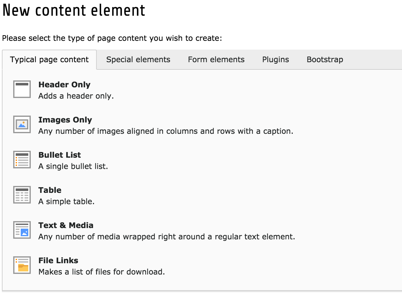
Case in point: the content element selector:

First of all, the page reloads completely after you click the “I want to add something here” button. This forces the user to switch context, something that should probably be avoided when composing a page.
Then comes the selector itself, layout in tabs. While this is great for not showing too much stuff, packing them neatly in categories, it becomes a clicky nightmare if you’re not sure where to find said stuff. The user will need to navigate through all tabs before finally finding what they’re looking for.
Here is my take on fixing this problem: page_quick_add

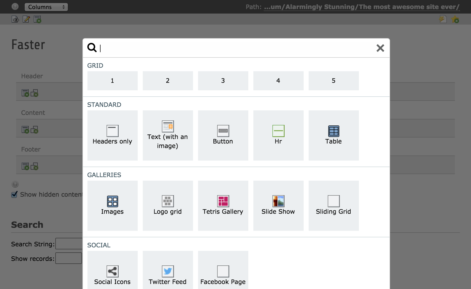
An overlay will load faster than a full page and bring less distraction.
There is a special section for grids: as they are simpler elements there is no need for an icon or descriptive text.
The search bar comes already focused and filters the list instantaneously, making discovery easier and much faster.
Furthermore, you can configure some existing content elements to be copied in a simple click. They will show up in the same popup with a custom name and icon. This is great to provide ready-made content for editors that they can simply edit, saving them a large amount of clicks sometimes.
This extension is configured with page TSconfig, so you can control the tabs, content elements and the “grid” section.
It’s available on the TYPO3 Extension Repository and on github.

Comments